Digital Media Convergence Ch 5
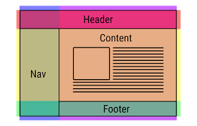
Ok, I am going to be really honest this chapter was soooooooooooooooooooooooooo boring. I understand that there are a lot of people that have spent a lot of time studying and moving things around to figure out the way websites and other page layouts look. Don’t get me wrong one of my favorite parts of this summer’s course has been creating flyers and a letter for our client but reading about it wasn’t quite as fun.
One of the things that stood out to me was how much math was involved. I can’t exactly say I am surprised because all of these mediums have specific measurements (pages and screens). When I am designing a flyer or letterhead or whatever I am not focused on the number aspect I am just focused on what looks good. For me, it is making sure that the text is readable. So that means having the info in small paragraphs, bullets, or columns. I like to make sure that the rows are not too close together. I would say 1.5 spacing. It takes up more space, but it is easier to read especially on a screen.
In this chapter, they also talk about font sizes. They talk about it in terms of headings. They give 6 different headings. The fonts range from 24 inches to 8 inches. I would have never thought to use a font smaller than 12 as a heading since 12 is usually what I use as my general font size. I feel like any smaller and it gets harder to read. I think 8 sized could be good for captions on pictures or graphs.
Do you have thoughts on page layouts? How about font sizes? Leave a comment below!
~Anne with an "e"


Comments
Post a Comment